 Dockbert
is a fantastic improvment to the default Deskbar in the BeOS. It's greatest
advantage is that it takes up very little screen space in comparison.
It's auto-hide feature is excellently implemented, and the animated logos
are just downright swish. Very nice.
Dockbert
is a fantastic improvment to the default Deskbar in the BeOS. It's greatest
advantage is that it takes up very little screen space in comparison.
It's auto-hide feature is excellently implemented, and the animated logos
are just downright swish. Very nice.
It is however not without it's problems (understandable, as this is an early release). I have some ideas about how Dockbert could be improved. Both it's interface and it's behaviours.
Some experience with Dockbert's existing features and behaviours is assumed.
Below are some problems that I have found with the current version of Dockbert, along with some solutions.
-
Multiple Trash Icons
Since the trash is on the dock, it seems kind of redundant to have it
on the desktop. Hide the trash on the desktop
-
Drag and Drop IMPLEMENTED
The ability to remove the short cuts by drag and dropping them into the
trash. Re-ordering by drag and drop.
-
Desktray (replicant shelf)
Icons normally kept in the desktray are not displayed. Place the replicants
at the start of the tabs.
-
Workspaces IMPLEMENTED
Some means of moving open windows between workspaces. Perhaps an option
on the workspace switcher icon. Ctrl + clicking on the icon could list
the open window with options on a submenu to direct a window to another
workspace.
-
Switching Applications IMPLEMENTED
Presently clicking on an application icon brings that app to the front.
It would be useful if repeated clicks on an application icon would allow
users to cycle through that application's open windows.
-
Customisation PARTIALLY IMPLEMENTED
Some means of allowing the users to customise the appearance of the dock.
The ordering of the tabs. Perhaps even the contents of menus (system commands
like shutdown and reboot for example).
-
Docklings
The ability to have more than one dock. The main dock and other child
'Docklings'. The docklings could be used anchor points for monitoring
(as the Desktray is now used for), or for shortcuts. These docklings could
share the main dock's behaviour (auto-hide, icon resize).
 IMPLEMENTED
VIA CUSTOMISATION The way the icons are ordered is a little
bit strange. Short cuts can be placed on any of the two tabs (or so it
seems), yet there is no way for the user to intuit why.
IMPLEMENTED
VIA CUSTOMISATION The way the icons are ordered is a little
bit strange. Short cuts can be placed on any of the two tabs (or so it
seems), yet there is no way for the user to intuit why.
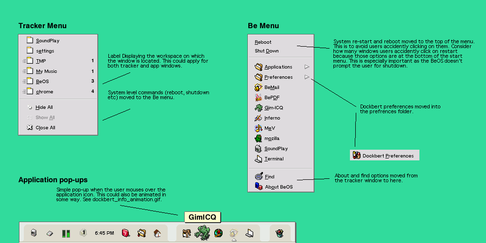
The Tracker could be grouped with the other apps (as it is on the standard dock). The Be menu could be located just after the time. The Trash at the right end to deliniate it from the other icons.
Please refer to the suggested layout for a better idea of what I am describing.
 IMPLEMENTED
Presently the menus are strangely ordered. For example, the system commands
(reboot, shutdown), are in the tracker menu, which is inconsistent with
the existing Deskbar. This may confuse users, so I suggest a re-ordering
of the menu contents.
IMPLEMENTED
Presently the menus are strangely ordered. For example, the system commands
(reboot, shutdown), are in the tracker menu, which is inconsistent with
the existing Deskbar. This may confuse users, so I suggest a re-ordering
of the menu contents.
One of the shortcomings of the Deskbar, is acertaining the location of windows. The Deskbar provides no information about which workspace an application is located on, only that it is on another. I suggest the inclusion of labels to show the location of windows within workspaces.
Please look at these suggested changes.

IMPLEMENTED The additions of text labels when the user mouses over the icons. If 2 applications have similar icons (or folders), it would be difficult to differentiate between them. A floating text label above the icons would be a boon (something akin to the labels in OS X). See example label.
Website E-Mail
Last update: 16/4/2002